Choosing the right colors for your wall art can completely change the vibe of your room. But with so many options, it’s easy to feel overwhelmed.
What if you could pick colors that not only match your style but also make your space feel more inviting and balanced? This guide will help you discover simple color palette tips that bring your walls to life and reflect your personality perfectly.
Keep reading, and you’ll learn how to create stunning wall art that speaks to you every day.
Choosing The Right Colors
Choosing colors for wall art can change the feel of a room. The right colors make spaces look bigger, warmer, or calmer.
Understanding how colors work together helps you pick art that fits your space perfectly.
Matching Wall Art To Room Colors
Match wall art colors to your room’s main colors for a balanced look. Use shades that blend well with your walls, furniture, and decor.
- Pick colors that repeat in your room for harmony.
- Use soft tones if your room has bright colors.
- Choose bold art if your walls are neutral.
- Consider the light in the room when selecting colors.
Using Complementary Colors
Complementary colors sit opposite each other on the color wheel. They create contrast and make your art stand out.
| Color | Complementary Color |
| Blue | Orange |
| Red | Green |
| Yellow | Purple |
| Pink | Light Green |
Playing With Monochromatic Schemes
Monochromatic schemes use one color in many shades. This style feels calm and clean. It adds depth without clashing.
Try this:Use light blue walls with dark blue art. Add soft blue pillows to tie the room together.
Credit: havenly.com
Creating Mood With Color
Colors in wall art can change the feeling of a room. Choosing the right palette helps create the mood you want.
Different colors bring different emotions. Use color to make your space cozy, calm, or full of energy.
Warm Tones For Cozy Spaces
Warm colors like red, orange, and yellow make rooms feel inviting and snug. These colors bring warmth and comfort.
Use warm tones in living rooms or bedrooms to create a cozy atmosphere. They help people feel relaxed and welcome.
- Red adds passion and energy
- Orange creates a friendly vibe
- Yellow brings happiness and light
Cool Tones For Calm Environments
Cool colors like blue, green, and purple help make a space feel calm and peaceful. They reduce stress and tension.
These tones work well in bedrooms, bathrooms, or offices. They help clear the mind and promote focus.
- Blue promotes relaxation and trust
- Green connects to nature and balance
- Purple adds calm and creativity
Bold Colors For Energy And Impact
Bright and bold colors like bright red, electric blue, or vivid yellow create energy. They make a strong visual statement.
Use bold colors in places where you want excitement. They work great in gyms, playrooms, or creative spaces.
- Bright red draws attention and power
- Electric blue sparks creativity
- Vivid yellow lifts mood and energy
Mixing Patterns And Textures
Mixing patterns and textures in wall art adds depth and interest to your space. It brings life to plain walls and makes your room feel unique.
Choosing the right colors, styles, and finishes helps create a balanced look. This guide covers key tips for combining these elements well.
Balancing Color Intensity
Strong colors can make patterns pop, but too many intense colors may overwhelm the room. Use a mix of bold and soft shades to keep harmony.
- Pair bright colors with neutral backgrounds
- Use one strong color as a focal point
- Let lighter colors balance darker tones
- Limit vibrant hues to small areas
Combining Different Art Styles
Mixing styles like abstract, vintage, and modern can create a dynamic gallery wall. Keep some elements consistent to avoid clutter.
| Art Style | Best Pattern Types | Suggested Textures |
|---|---|---|
| Abstract | Bold, irregular shapes | Canvas, matte finishes |
| Vintage | Floral, classic patterns | Distressed wood, linen |
| Modern | Geometric, clean lines | Glass, smooth metal |
Incorporating Metallic And Glossy Finishes
Metallic and glossy finishes add shine and catch light. They work well as accents in wall art to highlight patterns and textures.
- Use gold, silver, or copper in small doses
- Mix glossy art with matte textures for contrast
- Place shiny pieces where light hits directly
- Avoid overuse to keep a balanced look

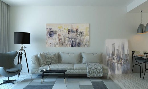
Credit: www.designcafe.com
Using Color To Highlight Features
Color plays a big role in how wall art looks in a room. It helps draw attention to important parts of your space.
Choosing the right colors can make your art stand out and improve the room’s mood.
Accent Walls With Art
Accent walls use bold colors to make art pop. A strong background color can bring focus to your artwork.
Pick a wall color that contrasts with your art to highlight its details and colors.
- Choose a color opposite to the main colors in the art
- Use deep or bright colors for small rooms to create depth
- Keep other walls neutral to avoid color clashes
Framing And Matting Color Choices
The frame and mat colors affect how the art looks. They can either blend with the wall or stand out.
Choose frames that match or complement the main colors in the art. Mats can add space between the frame and artwork.
- Light mats make dark art brighter
- Dark frames add contrast to light walls
- Neutral mats work well with colorful art
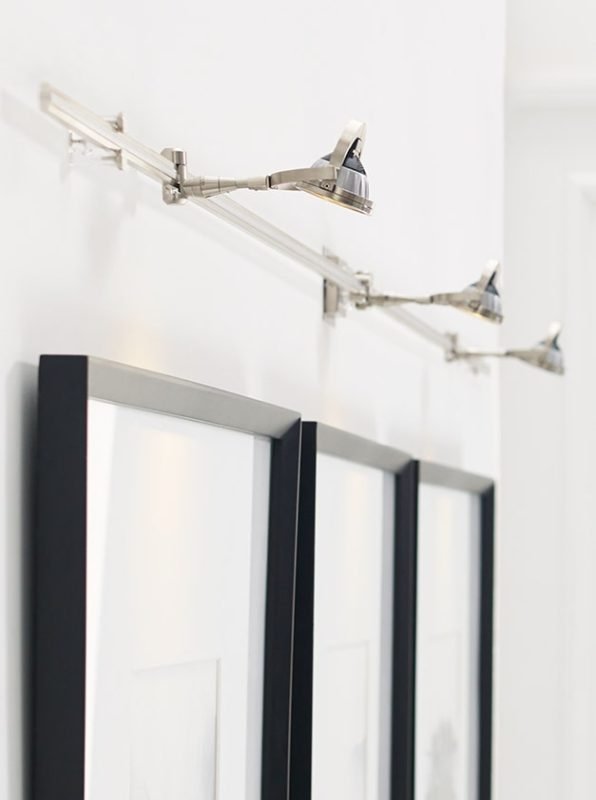
Lighting Effects On Color Perception
Lighting changes how we see colors in art. Warm lights make colors look softer, cool lights make them sharper.
Use adjustable lighting to highlight details. Shadows and brightness can change the mood of your artwork.
- Use spotlights to focus on key art features
- Natural light shows true colors but can fade art over time
- LED lights save energy and show colors well
Seasonal And Trendy Palettes
Wall art color palettes change with seasons and trends. Choosing the right palette can refresh your space.
Let’s explore popular trends, seasonal adaptations, and timeless combinations for your wall art.
Popular Color Trends In Wall Art
Trendy colors can make your home feel modern. Here are some current popular color trends:
- Earthy tones like terracotta and olive green
- Bold, vibrant shades such as electric blue
- Soft pastels like blush pink and mint green
Adapting Palettes For Seasonal Changes
Seasons can influence your color choices. Adapt your wall art to reflect the time of year.
For example, you might choose warm reds and oranges for autumn, or cool blues and whites for winter.
Timeless Color Combinations
Some color combinations never go out of style. They work well in any season or trend.
| Color Combination | Effect |
| Black and White | Classic and Sophisticated |
| Navy and Gold | Luxurious and Rich |
| Grey and Yellow | Modern and Energetic |

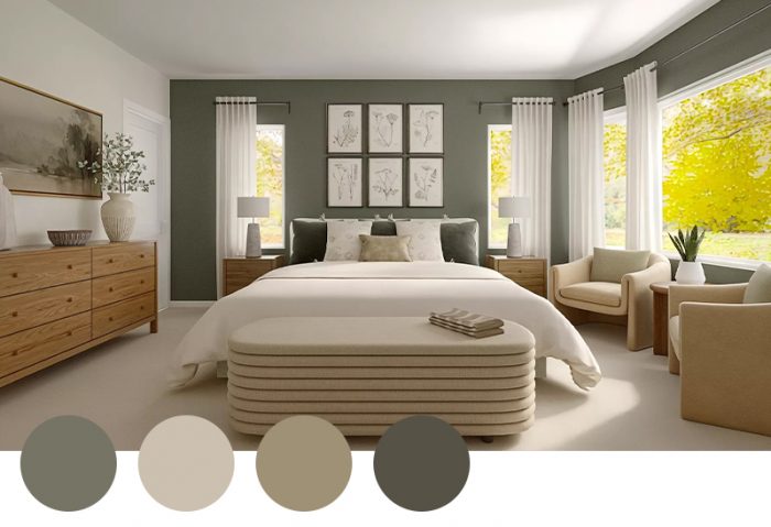
Credit: www.hgtv.com
Practical Tips For Color Selection
Choosing the right colors for wall art can change how a room feels. The colors you pick should match your style and the room’s mood.
Good color choices make wall art stand out and improve the room’s look. Here are some tips to help you select colors wisely.
Testing Colors Before Buying
Always test colors before you buy wall art. Colors may look different on a screen than in your room.
Try small color samples on your wall to see how they fit. Check colors at different times of day for the best view.
- Use paint swatches or color chips
- Place samples near your wall art location
- Observe colors in natural and artificial light
Considering Room Size And Lighting
Room size affects how colors appear on your walls. Dark colors make a room feel smaller, while light colors open up space.
Lighting changes color tones. Bright rooms handle bold colors well. Dim rooms need softer shades to avoid gloominess.
- Use light colors in small rooms
- Choose bold colors for large spaces
- Match colors with the room’s natural light
Avoiding Common Color Mistakes
Many people pick colors that clash or don’t match the room. Avoid these common mistakes to keep your space balanced.
Don’t choose too many bright colors. Limit your palette to two or three main colors for harmony.
- Avoid colors that blend too much with furniture
- Don’t ignore the wall art’s frame color
- Test colors before finalizing your choice
Frequently Asked Questions
What Colors Work Best For Wall Art Palettes?
Neutral tones like beige and gray suit most spaces. Bold colors add personality and create focal points. Consider room lighting and existing decor when choosing colors.
How To Match Wall Art With Room Colors?
Pick wall art colors that complement or contrast your walls. Use a color wheel to find harmonious shades. Matching accent colors in furniture or decor enhances cohesion.
Can Wall Art Colors Affect Room Mood?
Yes, colors influence emotions and atmosphere. Warm tones evoke energy and comfort. Cool tones promote calmness and relaxation. Choose colors based on the room’s purpose.
Should Wall Art Colors Follow Current Trends?
Trends can inspire but prioritize personal style. Timeless palettes ensure lasting appeal. Balance trendy hues with classic colors to keep your space fresh yet enduring.
Conclusion
Choosing the right colors for wall art can change any room’s feel. Simple palettes bring calm and balance. Bright colors add energy and fun. Think about your space and mood you want. Mix and match shades that speak to you.
Trust your eyes and feelings while picking colors. Your walls will tell a story with the perfect palette. Enjoy creating a space that feels just right.